Easy Group Benefits

Audited and redesigned the mobile user journey and form experience for a corporate benefits platform. Improved conversion rates and reduced task time with responsive, step-based design enhancements.

Category

Insurance

Role

UX Audit

Stakeholders

Client, Performance Marketing

Challenge

Easy Group Benefits aimed to increase mobile conversion rates through a streamlined online form. I was brought in for a UX audit and to advise on mobile-first optimization within existing technical constraints.

What I Did

Proposed Improvements

EGB's customers convert through completion of an online form. Through user data and interviews, EGB identified that the majority of these customers experience the form via mobile, and suspected that their conversion rates might be suffering as a result. My analysis highlighted 2 main areas for improvement:


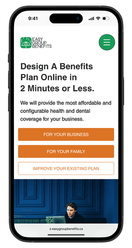
  1. The user journey to the form could be optimized for mobile as it required too much scrolling. I proposed a new design with call-to-action buttons above the fold, allowing users to quickly proceed to the form without scrolling.


  1. The form itself was not optimized for mobile as drop down menus and scrolling created friction. I proposed a new dynamic form with clear buttons to reduce the cognitive load put on users and to encourage their progression towards completion.

before

before

before

after

after

after

before

before

before

after

after

after

Audited the User Journey

  • Page hierarchies prioritized product information above CTA buttons, meaning users had to scroll down below-the-fold to discover how to progress.


  • It took too many clicks and scrolls to arrive at the form.

To improve the user journey from "Home" to "Get a Quote" I visualized the sitemap to understand the different user journeys. Despite having a homepage, the most common way for customers to reach the website is through Google Ads (green on the sitemap), which bring customers directly to sub-landing pages for different products. The sitemap revealed that the "Design Your Plan" page (blue on the sitemap) was an unnecessary step in the user journey and could be removed.

Analyzed the Form

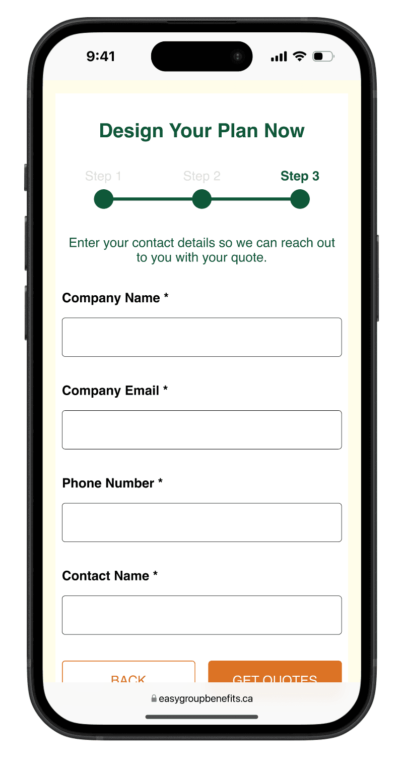
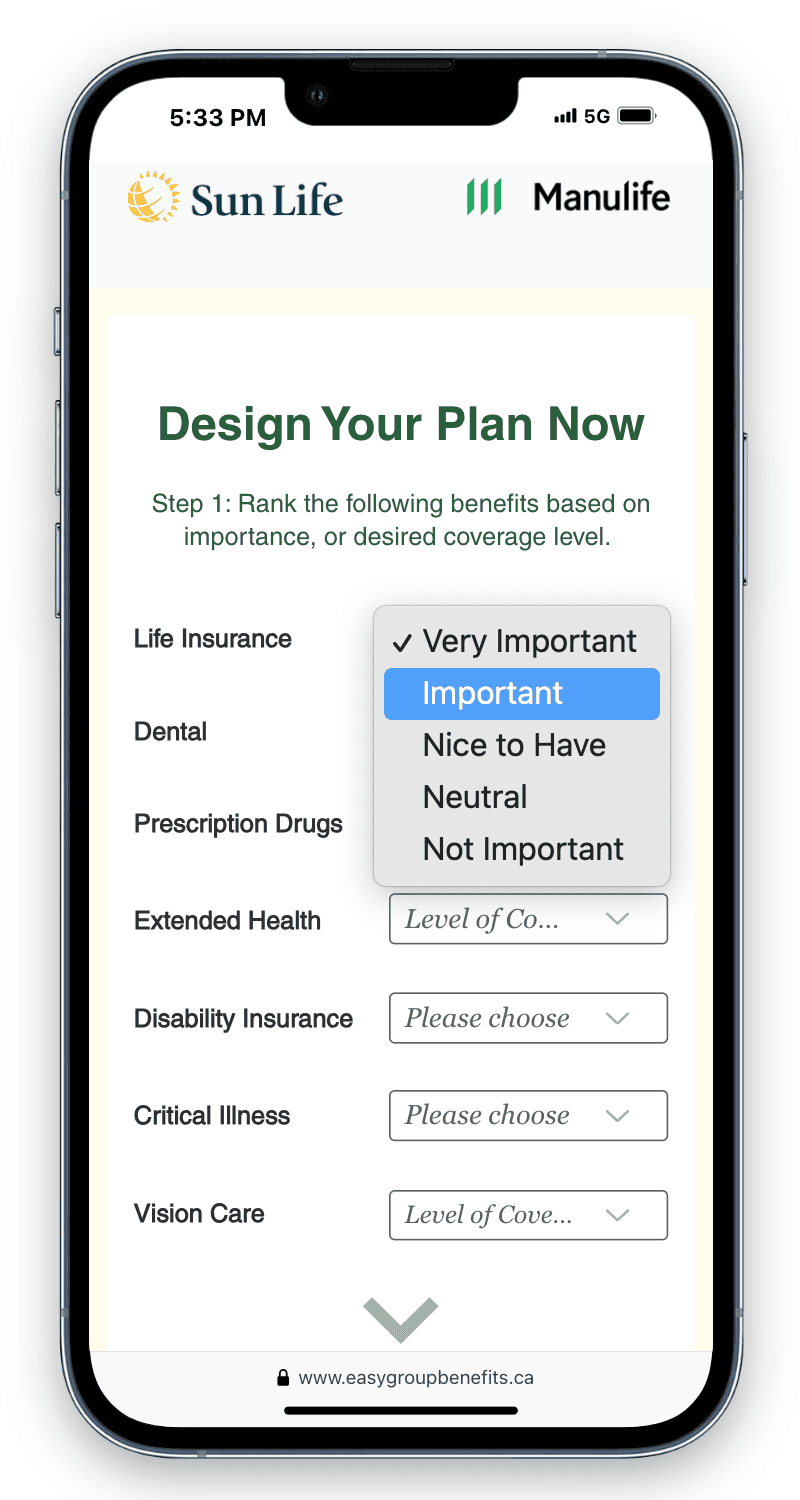
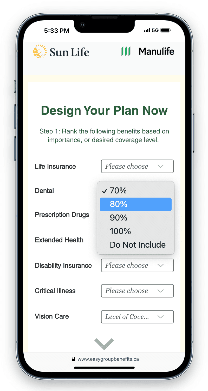
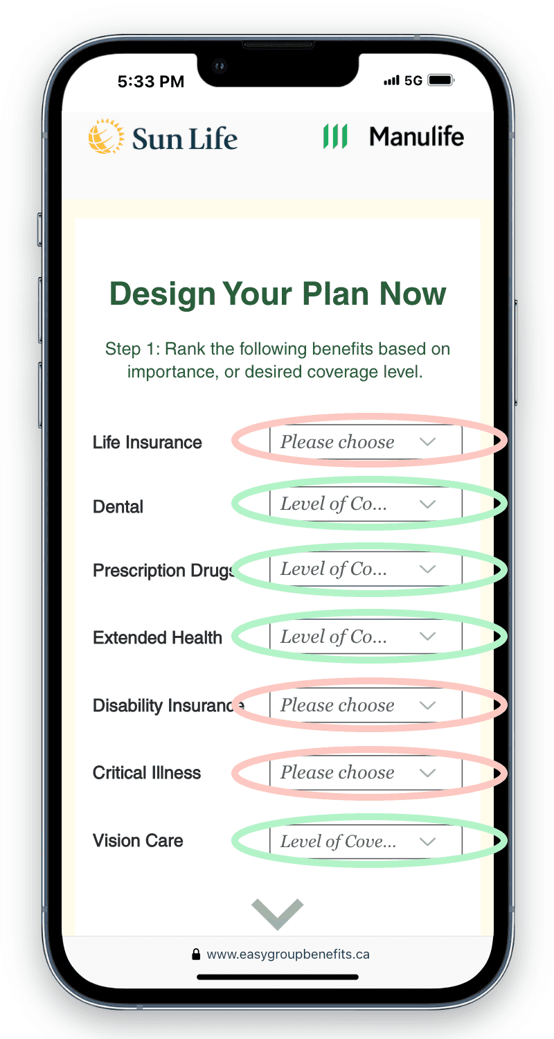
The form itself was not optimized for mobile. Drop-down menus were used, with two sets of answers available within the menus: one set for importance (short-form answers) and one set for level of coverage (value answers). While filling out the form the user must switch focus between these two types of answers, unnecessarily increasing the cognitive load of the form. Additionally, the long-scrolling form was not ideal for mobile.


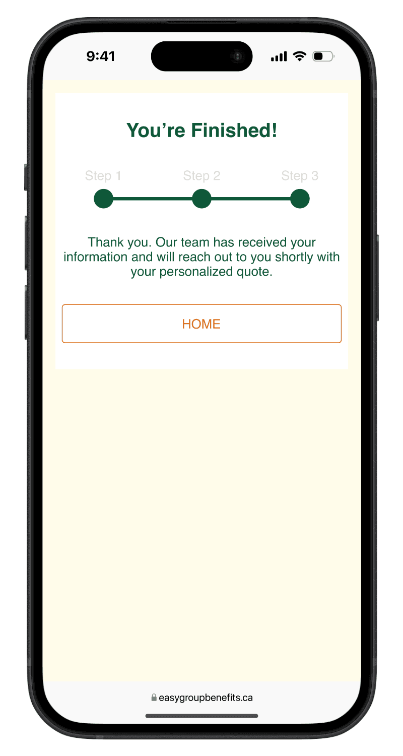
The final step of the form, the submit button, provided no feedback to the user. An automated email with confirmation would be sent to the user, but nothing would happen on the website. Users cannot be expected to immediately check their email for confirmation and should not be left wondering on the website.

short-form answer

short-form answer

short-form answer

value answer

value answer

value answer

short-form (red) value (green)

short-form (red) value (green)

short-form (red) value (green)

Shortened the User Journey

  • Get customers to the form quickly, without scrolling.


  • The new user flow require only 2 clicks from the homepage to the form.


  • New hierarchy prioritizes CTA buttons and requires less scrolling to proceed.


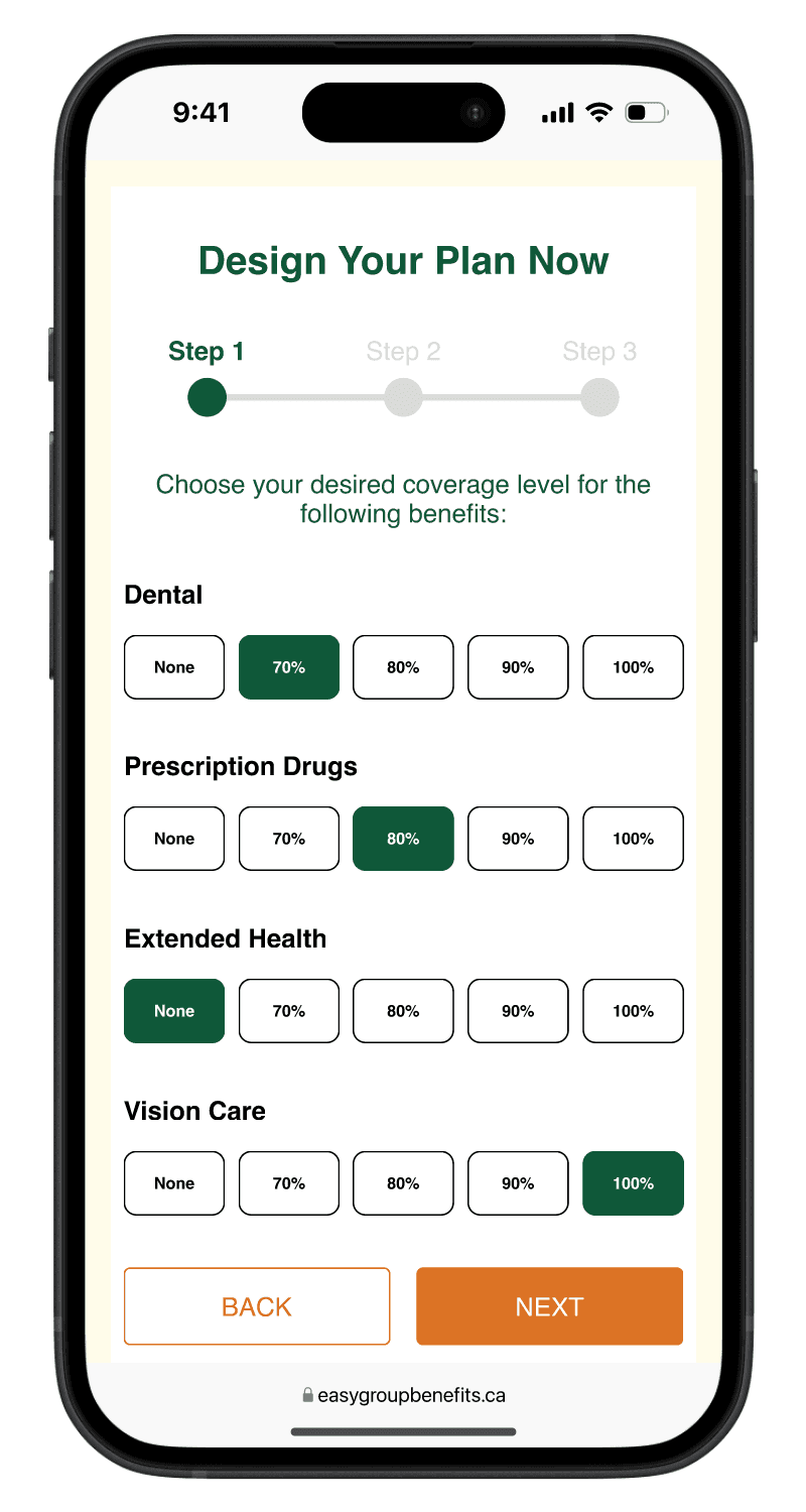
  • The form is more dynamic and gratifying for users to complete.

Guided the Users

  • CTA buttons above-the-fold guide the user to each of the 3 products.


  • The option to choose between business or family from the start eliminates a step and simplifies the flow.


  • Users can still scroll down to learn more, as the original product information is still below.


  • Buttons are noticeable and familiar so that users always know how to proceed no matter where they are on the website.

new homepage

new homepage

Revamped the Form for Mobile

Step 1

Step 1

Step 1

  • Multi-page form breaks up the steps, eliminates scrolling, and minimizes the perceived complexity by allowing the user to focus separately on the short-form answers and the value answers.


  • The new design is more visually engaging, more enjoyable to use and easier to complete, which all come together to have a positive effect on the conversion rate.


  • Selection buttons gives the user a clear overview and are easier to use on mobile


  • Completion confirmation screen follows step 3 to reassure the user that their submission has been received.

Step 2

Step 2

Step 2

Step 3

Step 3

Step 3

Complete

Complete

Complete

The Outcome

Results

User Centered Design

Brought UX principles to the forefront for an existing product in a way that considers technical limitations, setting the stage for measurable business growth.


Mobile First

Optimized the user user journey, cutting task completion time by 40% by optimizing interactions for mobile users.


Form Design

Enhanced form usability with a step-by-step process with progress indicators, boosting conversion rates by 15%.

Takeaways

Clarify the Flow

Visualizing the user journey helped simplify and shorten it.


Respect Mobile Users

Mobile-first design revealed hidden friction and removed it.


Design Feedback Loops

Users benefit from immediate feedback, not delayed confirmations.

© 2024 David Tucker

© 2024 David Tucker