CallPad.ai

Streamlined a mobile web app for an AI assistant, redesigning key screens to improve navigation, user trust, and feature clarity. Delivered a minimalist UI backed by iterative user testing and developer-aligned design specs.

Category

AI Phone Assistant

Role

Freelance UX/UI Design

Stakeholders

CEO, Developer

Challenge

CallPad, an AI startup, needed a mobile-first, intuitive UI that could be implemented quickly without a full-time design team. My objective was to improve usability, trust, and visual design in a fast-paced, lean environment.

What I Did

Audited Existing Mockups

When I joined the project, CallPad had basic mockups in Figma but lacked a cohesive design approach. I began by identifying key areas for improvement and discussing them asynchronously with the team via Figma.


  • Misaligned Metrics: The app displayed statistics like "Total Sales" and "Sales Lift," even though CallPad did not process payments or track revenue.

  • Cluttered Call Drawer: The bottom drawer, which housed missed calls, was not optimized for jobs-to-be-done.

  • Inconsistent Layout: Spacing, padding, and line heights lacked consistency, making the interface feel unpolished and difficult to navigate.

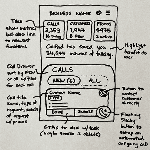
Brainstormed Improvements

  • Ensure that users can quickly access the most relevant information. Make the call drawer more prominent by removing unnecessary actions.

  • Streamline navigation, and replace redundant sales statistics with top tiles featuring actionable buttons for Calls, Customers, and Promos.

  • Introduce personalized information to guide new users through the setup process and highlight the platform’s value.

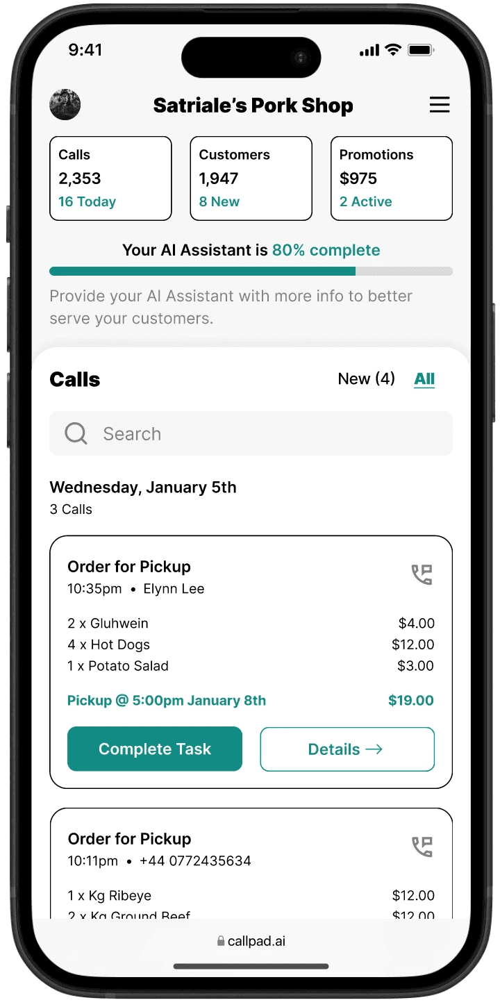
Redesigned the Home Screen

  • Refined Call Drawer: More prominent, with added features like a simple filter and search bar.

  • Clarified Call Tiles: Redesigned to highlight the most relevant information at a glance.

  • Streamlined Layout: Consistent spacing and typography, making key actions easier to find.

  • Onboarding Progress Bar: Encourages engagement by showing the user how much of CallPad’s functionality they’ve explored.

Workshopped the Call Tile

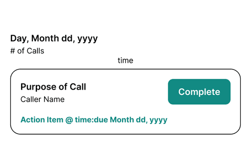
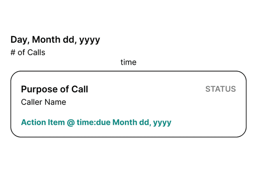
I explored different call tile formats, ranging from highly detailed to minimal. The CEO validated the best approach through early user testing. Users preferred a minimal design that displayed more calls on the homepage while allowing them to click for detailed information on a dedicated screen.

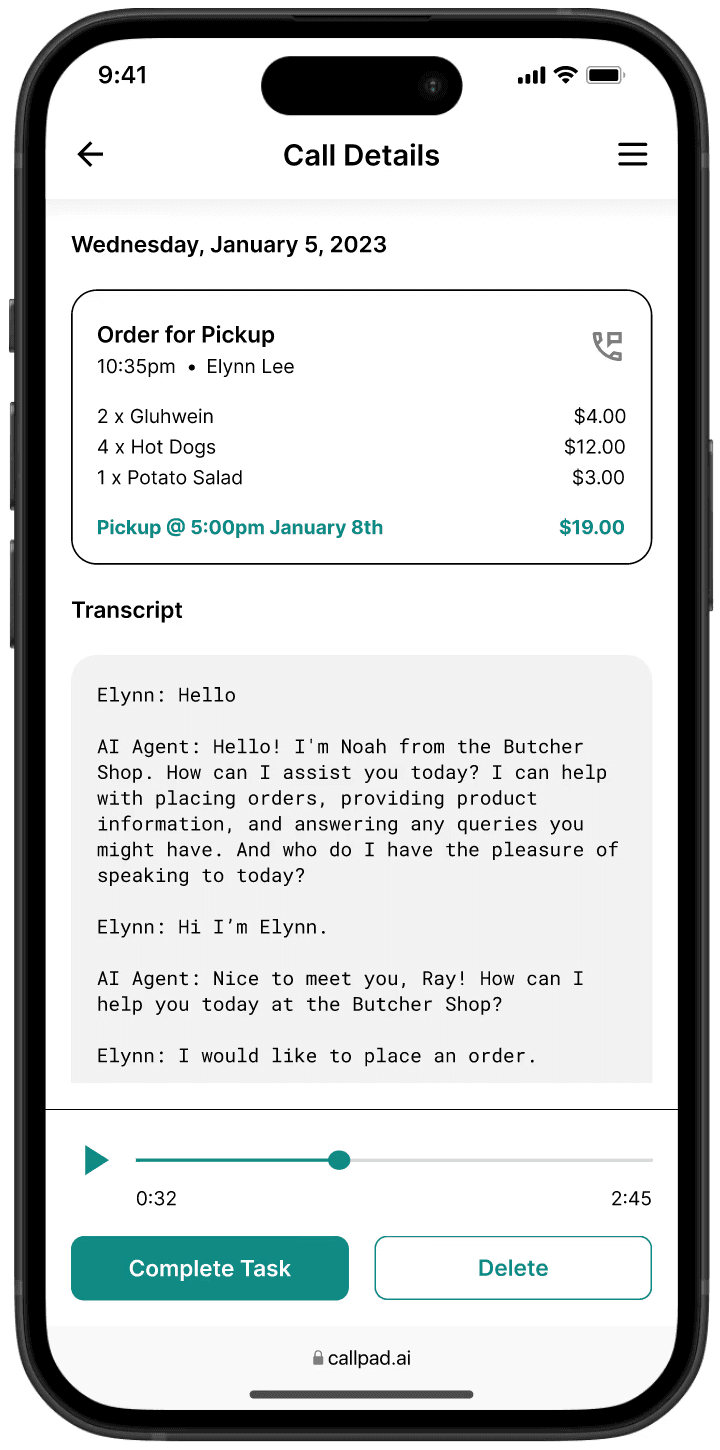
Introduced the Call Detail Screen

I designed a new call detail screen to house in-depth call information, allowing the main call tiles to remain simple and focused. This screen provides a clear summary of key call details and includes a full transcript and audio playback. By giving users access to the original conversation, it reinforces trust in the AI assistant and ensures transparency in CallPad’s decision-making process.

Explored a Minimalist UI

As a final design study, I was asked to explore a stripped-down home screen concept. This design focused solely on new calls, moving all secondary features into a hamburger menu. This exercise helped the CEO envision how a hyper-streamlined UI might function and how different levels of complexity could impact usability.

The Outcome

Results

Refined Home Screen

A new layout that prioritized jobs-to-be-done and improved navigation.


AI Transparency

Call transcripts and playback to build trust in the AI assistant’s decision-making process.


High-Fidelity Mockup

A preview of the home screen’s potential with a clean, minimalist design that enhances usability.

Takeaways

Prioritize User Needs

Replacing vague metrics with actionable insights improved usability.


Simplification Enhances Usability

Reducing clutter made navigation more intuitive and efficient.


Iterate & Test Early

Exploring different UI approaches led to valuable insights that informed better design decisions.

© 2024 David Tucker

© 2024 David Tucker